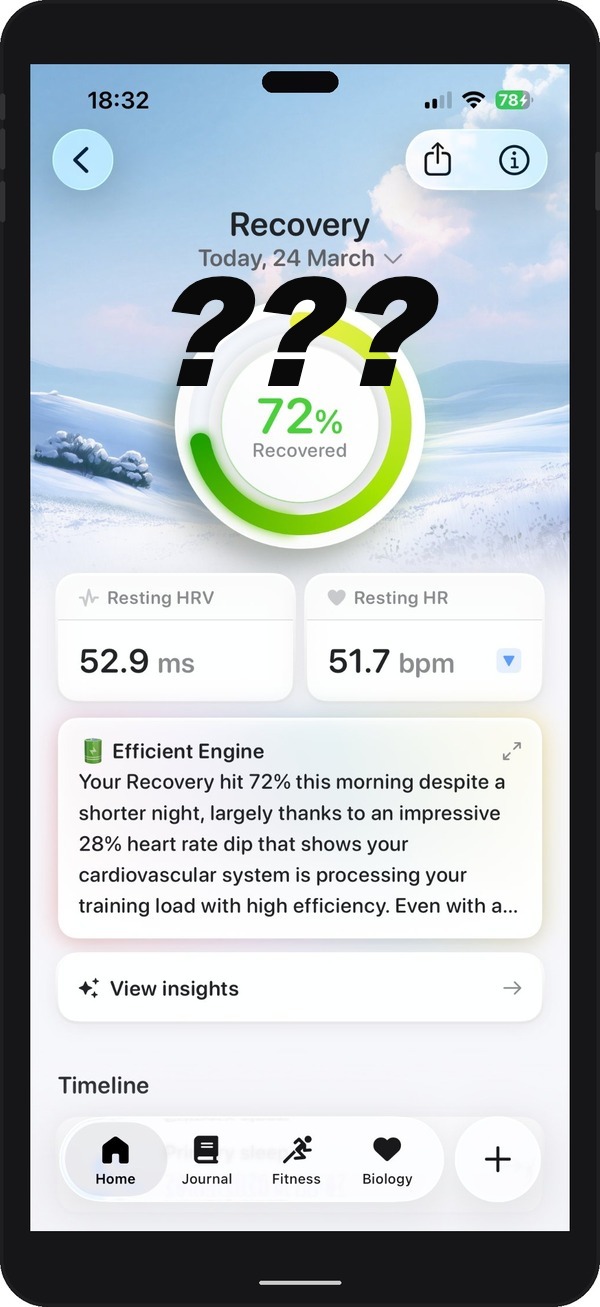
You open your app first thing in the morning. Before coffee. Before you have looked at your phone or checked the weather.
Recovery: 72%.
You stare at it. Is that good? Is 72 a pass or a fail? Should you run hard today or take it easy? Should you trust it or ignore it?
You close the app and go make coffee, none the wiser.
If this sounds familiar, you are not alone. Millions of runners check recovery scores every morning and come away with the same confusion. The number feels meaningful. It sounds scientific. But it does not tell you what to do.
Here is the uncomfortable truth: most recovery scores are not useless because the underlying data is bad. The data, HRV, resting heart rate, sleep, is genuinely valuable. Recovery scores are useless because they reduce a complex, multi-layered picture of your physiology into a single number, strip away all the context, and give you no guidance on what to actually do next.
This post explains how recovery scores work, why they fall short, and what actually matters when it comes to making smart daily training decisions.
How Recovery Scores Work
Most recovery scores are built around Heart Rate Variability, or HRV. This is worth understanding because it is genuinely fascinating science.
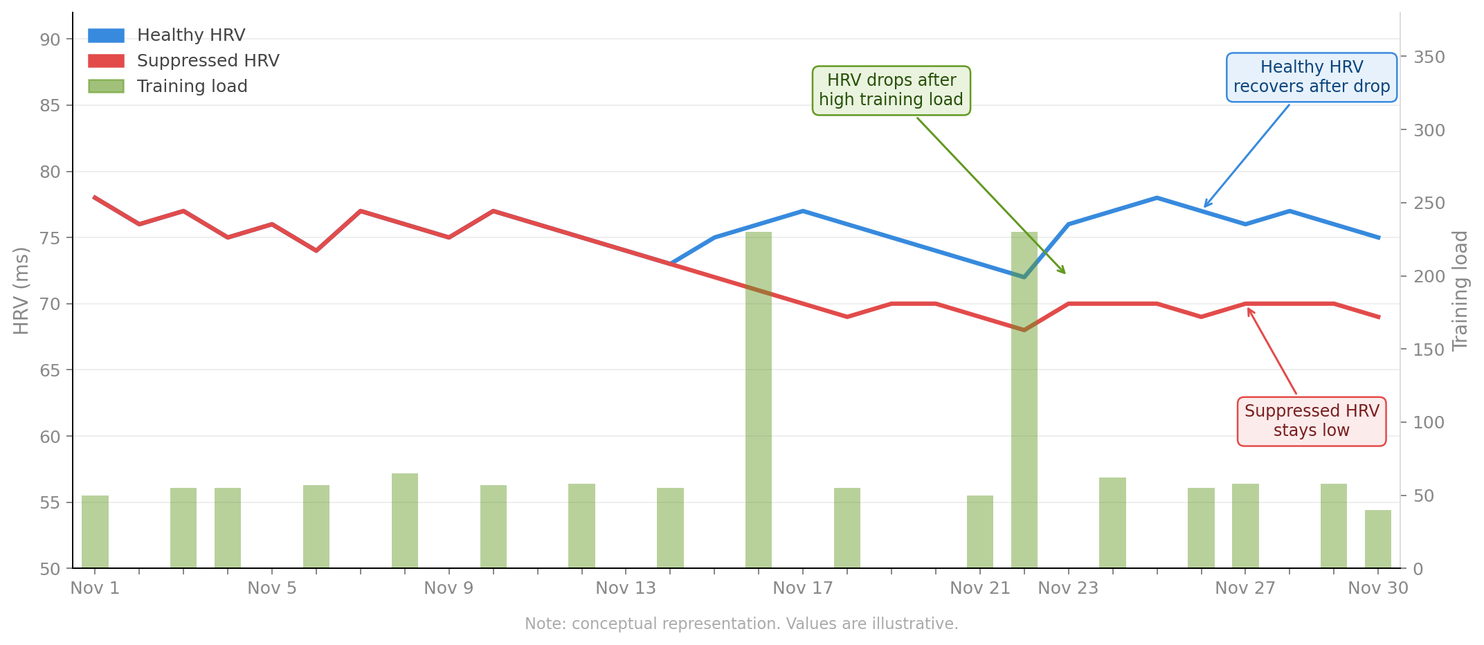
HRV measures the variation in time between consecutive heartbeats. Your heart does not beat with the regularity of a metronome. The gap between each beat varies slightly, and this variation reflects the balance between your sympathetic nervous system (the fight-or-flight system that activates under stress) and your parasympathetic nervous system (the rest-and-digest system that dominates during recovery).
When your body is well-recovered, your parasympathetic system is dominant. HRV is higher. When you are stressed, from training, poor sleep, illness, or life, your sympathetic system activates. HRV drops.
This is why HRV is such a useful proxy for recovery. It reflects what is happening at the level of your nervous system, not just your muscles.
Most apps take your HRV reading, compare it to your recent average, and produce a score. Some also factor in resting heart rate and basic sleep data. The formula varies between apps, but the output is usually the same: a number between 1 and 100, sometimes colour-coded green, amber, or red.
The science is solid. The problem is what happens next.
Why It Is Not Enough
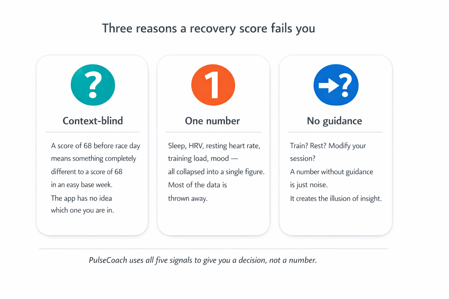
Three problems turn a good scientific foundation into a frustrating number on your screen
Problem 1: Context-blind.
A recovery score of 68 means something different if you have a 10k race in three days versus a rest week versus a base-building phase. It means something different if you are a seasoned marathoner with 60 miles per week in your legs versus a returning runner rebuilding after injury. The score does not know any of this.
Recovery is not an absolute state. It is relative to what you are asking your body to do. A score of 68 on a light week might be perfectly fine for a hard session. The same score three days before your target race might mean you need to back off entirely.
Problem 2: One number cannot capture your physiology.
Your readiness to train is shaped by multiple overlapping signals. HRV and resting heart rate are two. But sleep quality and duration matter independently. Training load over the past week matters. Training load over the past month matters. How you felt during yesterday's session matters. How you feel right now matters.
Collapsing all of this into a single score discards most of the information. Worse, it gives you false precision: the impression that a complex biological picture has been neatly resolved into a tidy number.
Problem 3: No guidance.
Even if the score is accurate, it does not help you decide what to do. Train? Rest? Modify today's session? Which session? By how much?
A number without guidance is just noise. It adds information without reducing uncertainty, which is arguably worse than having no information at all, because it creates the illusion of insight while leaving you exactly where you started.
What Actually Matters
Smart training decisions come from looking at the right signals in the right way.
Your baseline, not a universal standard.
An HRV of 45 might be low for one runner and high for another. What matters is not your absolute HRV but how it compares to your personal baseline, typically your rolling 7-day or 30-day average. A reading that is 15-20% below your baseline is a meaningful signal. A reading that is 5% below it is probably noise.
This is why apps that compare you to population averages are unreliable. Your body is not the population average.
Trends over time.
A single low HRV reading tells you less than a trend of declining HRV over several days. One bad night tells you less than a pattern of disrupted sleep. Look at the direction of travel, not just today's snapshot.
Training load.
This is the signal that most recovery apps ignore completely, and it is arguably the most important one for injury prevention. How much have you trained in the past 7 days compared to your 28-day average? If you have ramped load quickly, your injury risk climbs even if your HRV looks fine. More on this below.
How you actually feel.
Subjective wellness, including mood, energy, motivation, and perceived muscle soreness, is a legitimate data point. Research shows that athlete self-reporting often catches overreaching before physiological markers like HRV do. Do not dismiss how you feel because your score looks okay.
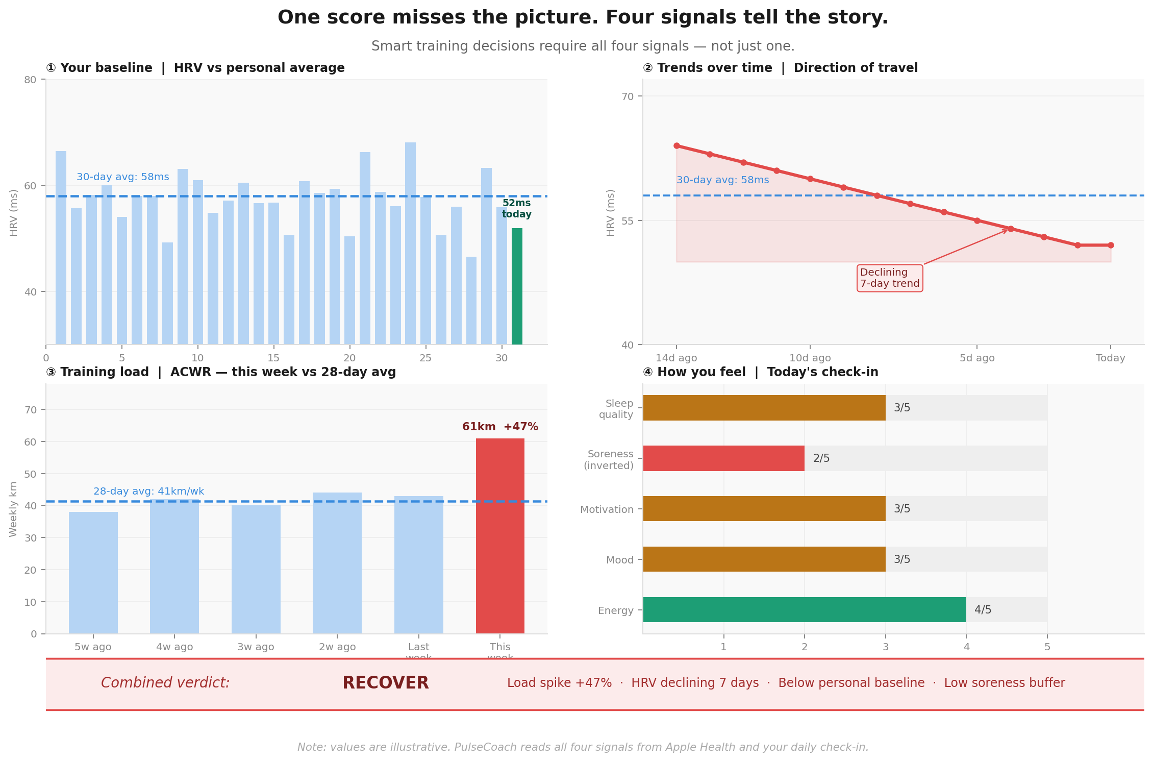
A Real Example
Emma is training for a spring marathon. She is in peak week, eight weeks out from race day. Here is what her data looks like on a Tuesday morning:
- HRV: 3% below her 7-day average. Mildly low, but not dramatic.
- Resting heart rate: 1 beat per minute above her recent average. Barely notable.
- Sleep: 6.5 hours. Below her usual 7.5.
- Training load over the past 7 days: High. She has run 55 miles after a 42-mile week.
- How she feels: Good. Legs feel fresh. Motivated.
A standard recovery app looks at HRV and resting heart rate and gives her a score of 71. Green. Train.
But look at the full picture. HRV is dropping. Sleep is below average. And her training load has jumped 30% in a single week, which puts her squarely in the caution zone regardless of how her legs feel!
How you feel and how recovered you are do not always agree. This is especially true in the 48 hours after a hard session, when your nervous system is still recovering even though your legs feel okay.
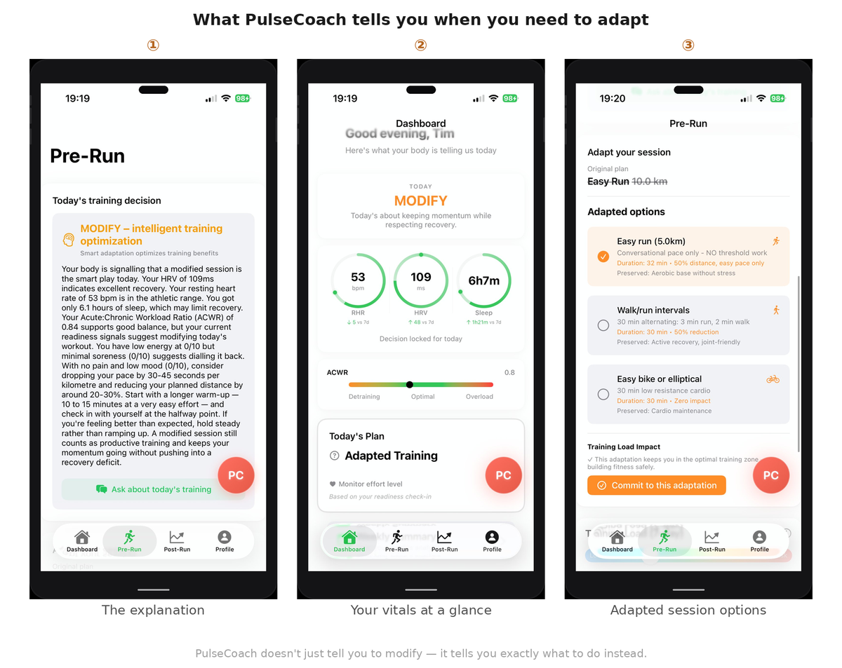
A more complete picture gives Emma an ADAPT verdict. Keep moving. Run easy. Do not push today.
Emma runs easy. The rest of her week goes well. She arrives at race day healthy.
This is not magic. It is a more complete picture.
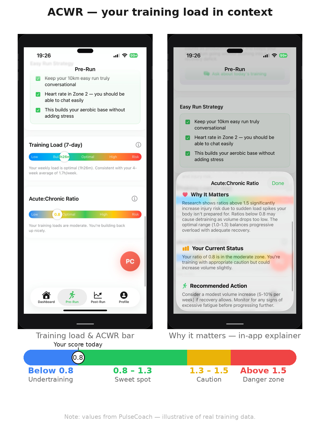
The ACWR Framework
The Acute to Chronic Workload Ratio is one of the most evidence-backed tools in sports science for managing training load and reducing injury risk. It is also almost completely absent from consumer running apps.
Here is how it works.
Your acute workload is how much you have trained in the past 7 days. Your chronic workload is your average weekly training over the past 28 days. Divide acute by chronic and you get your ACWR.
ACWR 0.8 to 1.3: Safe zone. You are training at a level consistent with your recent history. Injury risk is low.
ACWR above 1.5: Danger zone. You have ramped load too quickly. Research shows injury risk climbs significantly above 1.5. This is where most training injuries come from, not single sessions, but patterns of sudden load increases.
ACWR below 0.8: Undertraining zone. You are doing significantly less than your average. Sometimes appropriate during a recovery week or taper, but sustained detraining increases injury risk when you return to normal load.
The sweet spot is building load gradually, keeping ACWR between 0.8 and 1.3, and avoiding the spikes that come from rushing fitness or returning from illness too quickly.
Most runners who get injured have one thing in common: they increased load too fast. ACWR is the framework that catches this before it becomes a problem.
Conclusion
Your Apple Watch is collecting genuinely useful data. HRV, resting heart rate, sleep, VO2 max, training load. It is all there, sitting in Apple Health.
The problem is not the data. The problem is what happens to it. Most apps compress it into a number, strip away the context, and leave you without guidance.
What you need is not a score. You need a decision. TRAIN. ADAPT. RECOVER. With an explanation that tells you why, and guidance on what to actually do today.
One clear decision beats a confusing number every time.